Activation & settings:
To install beauty gravity from menu, choose plugin and activate Beauty gravity.
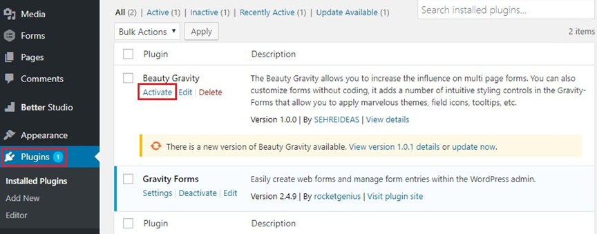
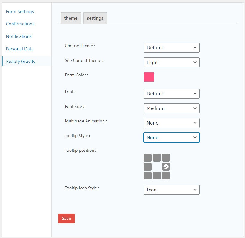
After the plugin activation, an option as the name of Beauty Gravity is added to the setting of every each of your forms.
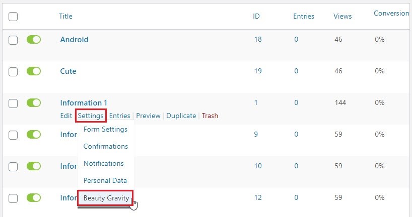
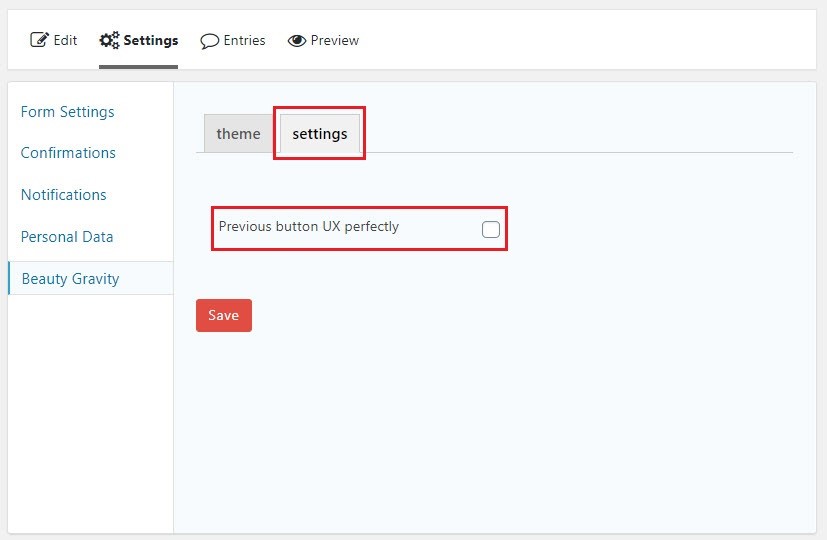
By clicking on it you enter the page below with theme & settings tabs, which it’s possible to do the setting related to each form.
Multi-page animations:
One of the features of Beauty Gravity/ this plugin is the ability to add animation to multi-page forms. to do so enter a form page and from the setting of your intended form, click on Beauty gravity.
In the shown page from multi-page, choose your favorite animation and save it.
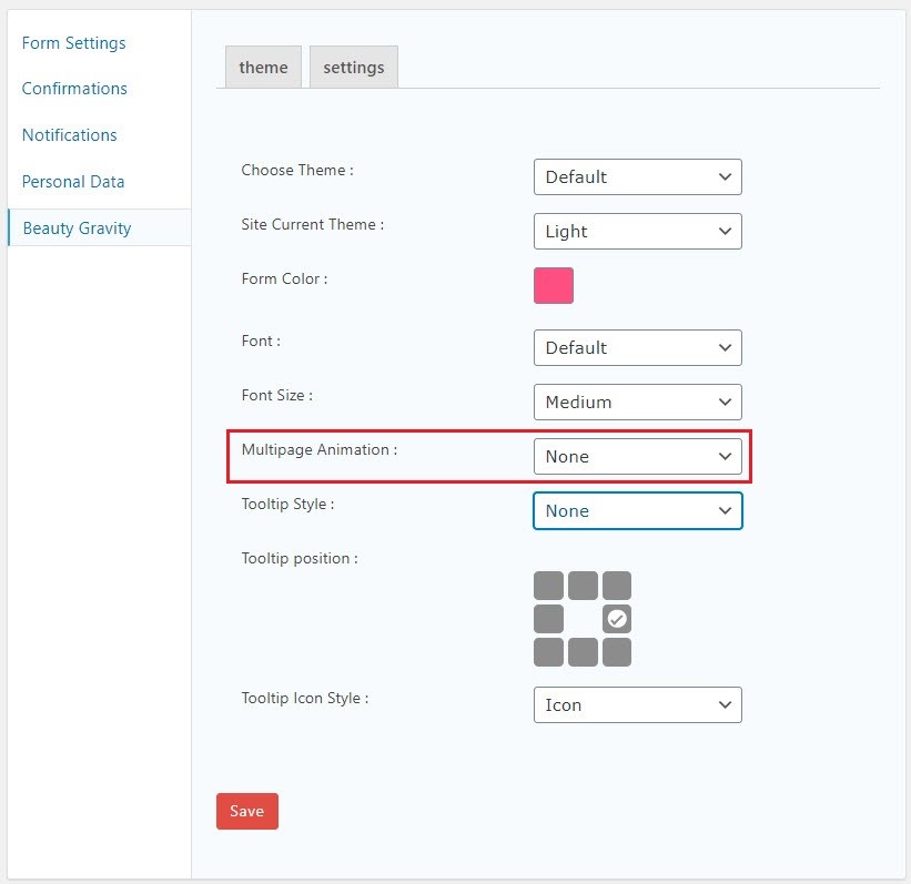
Notice: to activate the animation on multi-page forms, active the Enable Ajax checkbox
Theme:
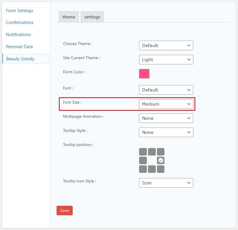
This plugin is capable of adding multifarious & delightful themes to your forms to lessen the monotonousness and dull of your forms. To do the related settings from form pages and from settings menu choose Beauty Gravity. Themes put in this plugin are nicely customized to let you select the theme & color of your forms absorbing without any graphical and codding knowledge requirement. In this part 3 parts are available to do graphical theme for your forms.
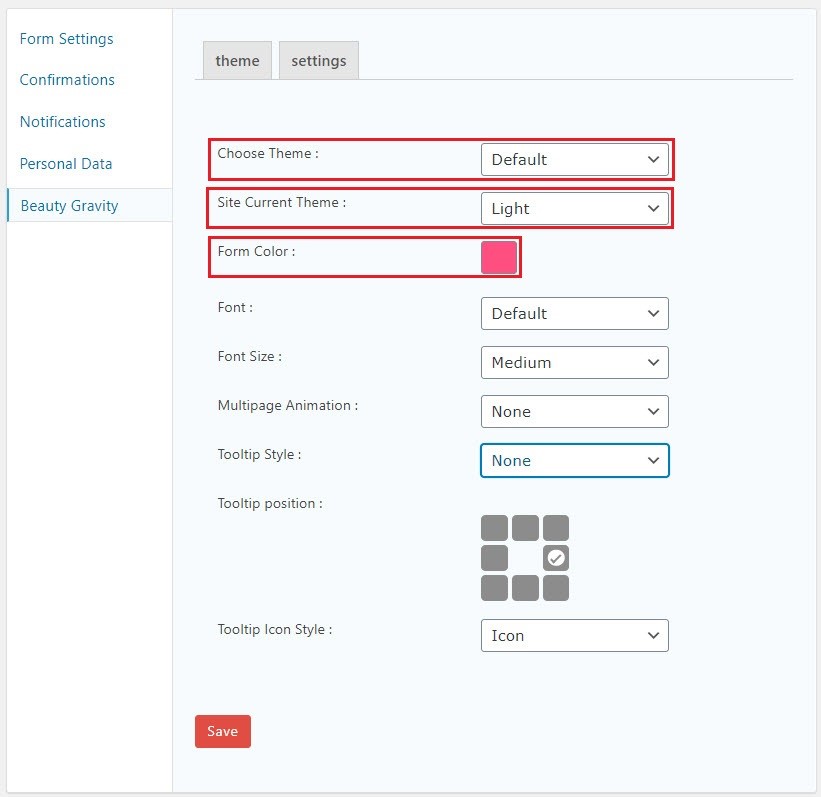
Choose theme: select your intended theme
Current site theme: here you can choose if your background is light or dark.
Form color: select your theme color from this part.
Tooltip:
this feature of Beauty Gravity allows you to put every description you want as a tooltip on your fields. By installing this plugin, a field as the name of tooltip will be added to the general menu of all fields.
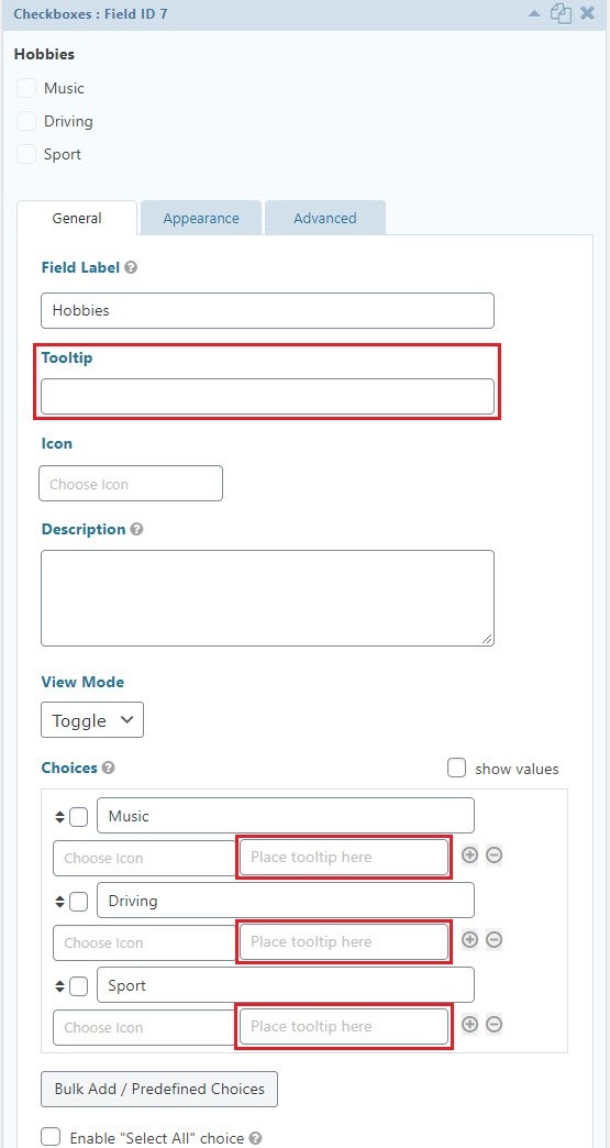
In this part enter your text, then update the form and from settings menu select Beauty Gravity. As yoou can see in the page bellow, three parts appears for tooltip settings.
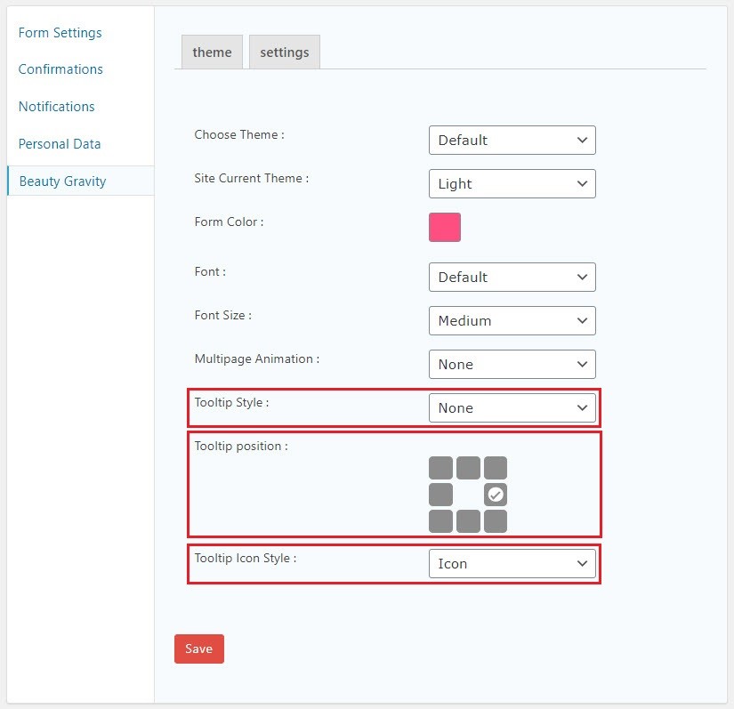
Tooltip style: select the style of your tooltip from this part.
Tooltip position: choose the placement of your tooltip from this part.
Tooltip icon style: choose how you want your tooltip appears.
Notice: tooltips are available on forms only if the style of tooltip is chosen before. In case tooltip style is chosen as NONE, tooltip will not be available in your form even if you have entered text in tooltip field.
Radio/ checkbox modes:
With this feature you can change the look of Radio/ checkbox fields to new elements such as toggle and button mode. To do the setting after installing the plugin in general tab, fields from Radio/ checkbox mode an option appears as “view mode” which let you choose the view state as Default, Button or Toggle mode.
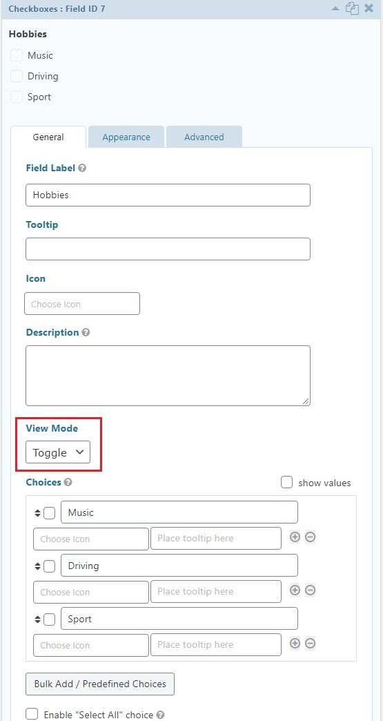
Notice: view modes are customized according to the selected theme.
Notice: in case you haven’t selected a theme for your form, view mode will not be applied to your form.
Field icon:
in purpose of making user friendly forms it’s possible to add icon to your fields. To add icon after the installation of Beauty Gravity, a field as the name of Icon will be added on to every general menu fields.
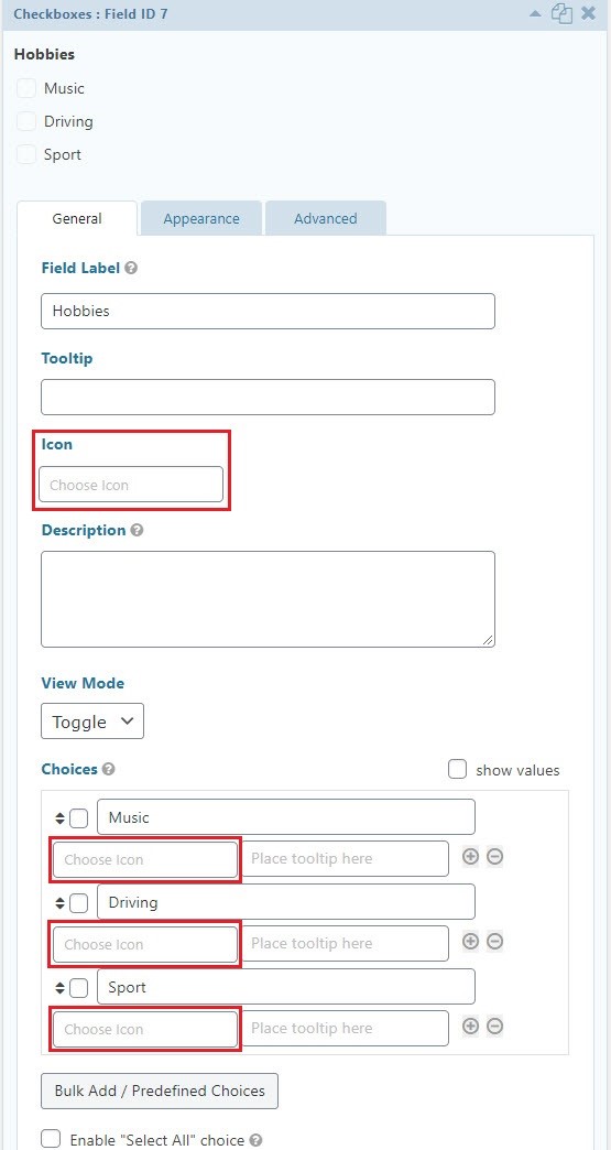
By clicking on this field a list full of fontawesome appears on page. Select your favorite icon, next update the form.
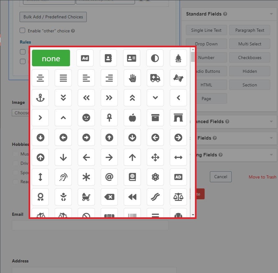
Notice: in checkbox & radio fields icons apply on options only if view mode is in button state.
Font:
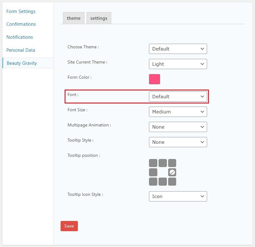
if you want to change the font of your forms, from form settings click on beauty gravity.
From FONT you can select your intended font.
Font size:
Beauty gravity allows you to choose 4 customized sizes for each of our forms. to change the size font from form settings go to beauty gravity menu and from font size select your size.
